

(01)
Project Overview
Levantine food, without the usual symbols
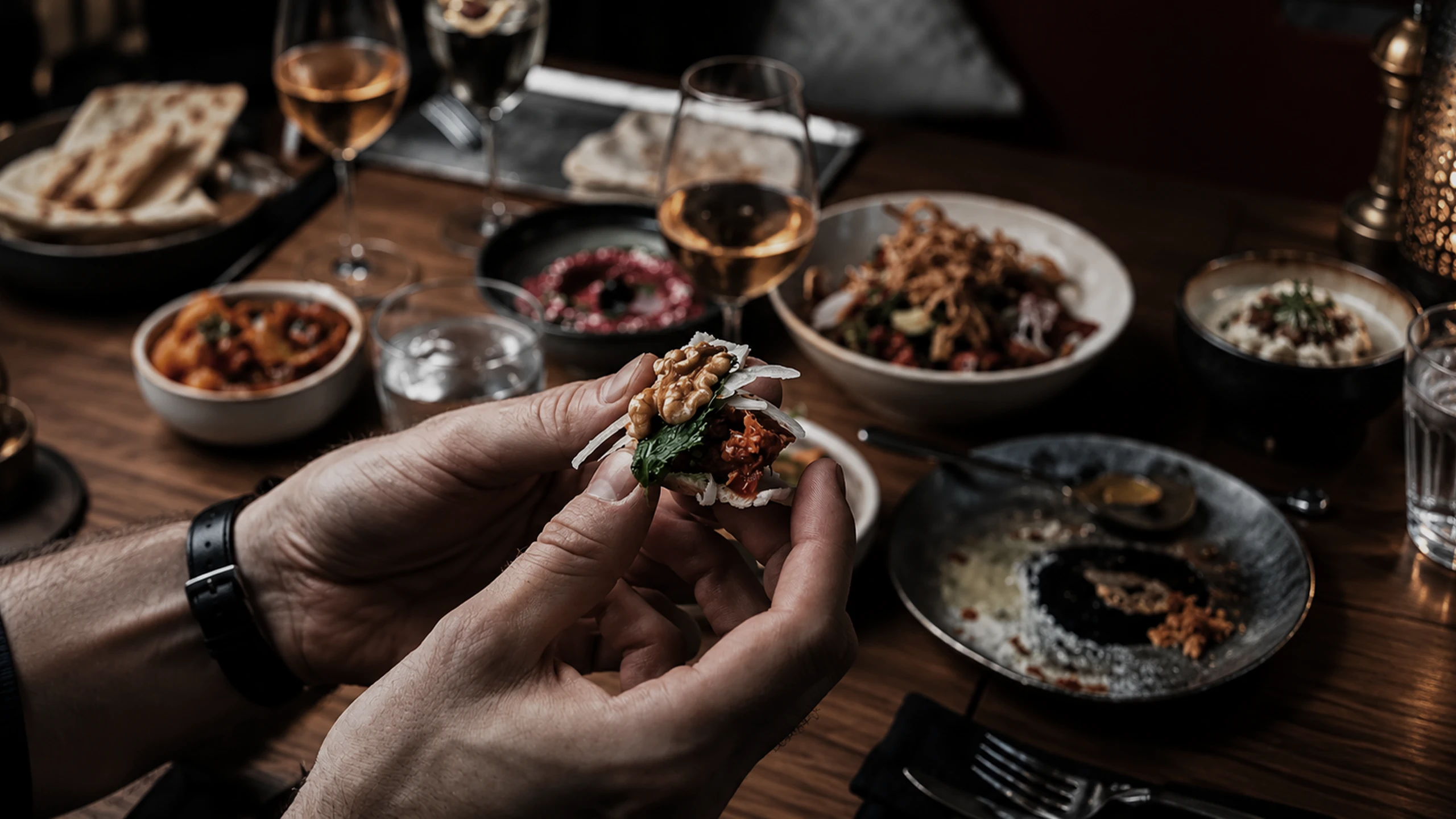
Yasma is a Levantine restaurant in Vancouver, built by founders who wanted the food’s cultural depth present in the brand rather than decorating it.
Middle Eastern restaurants in North America are usually branded with the same small set of borrowed symbols. The shorthand is legible and it flattens every restaurant using it into the same one.
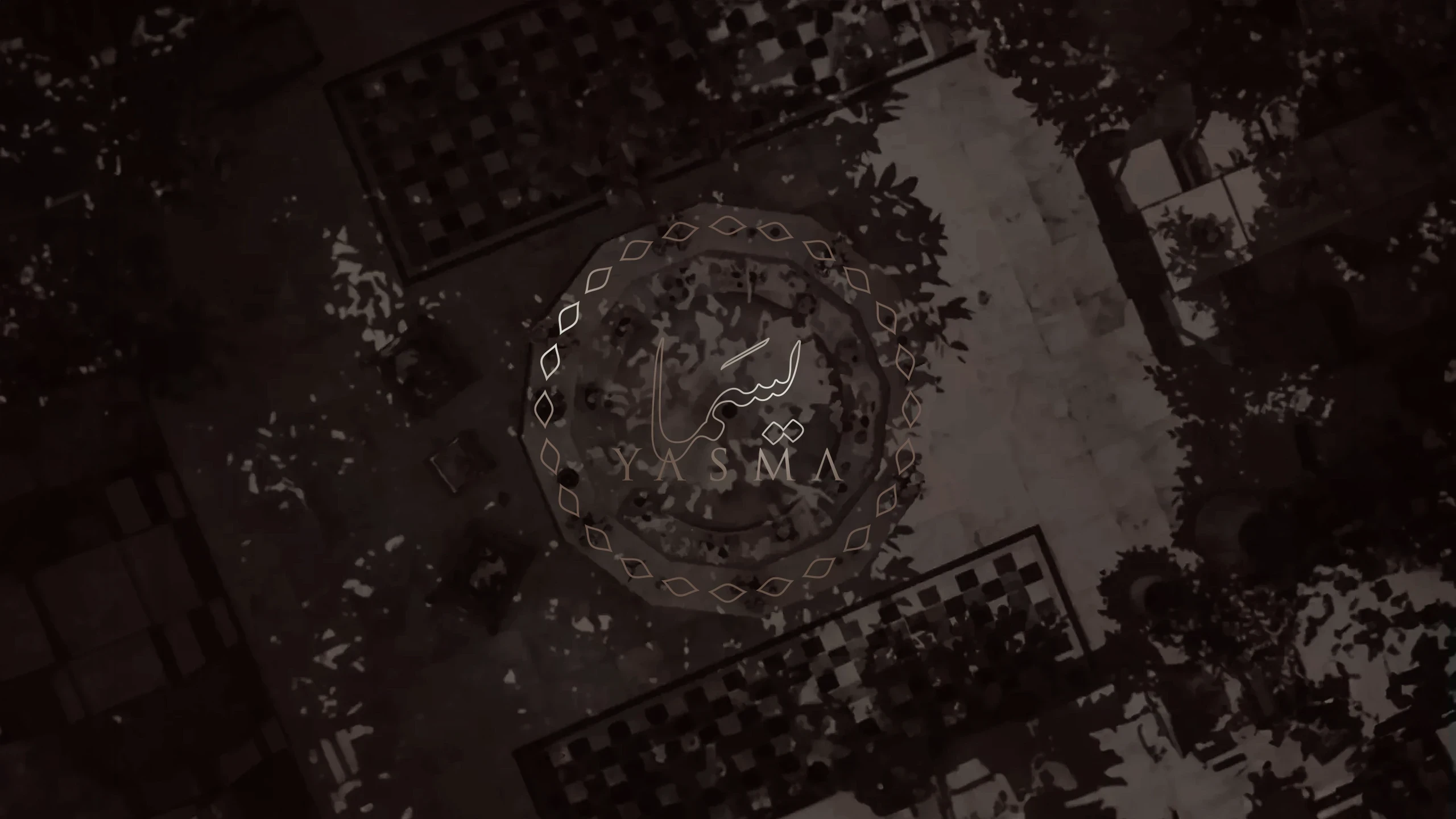
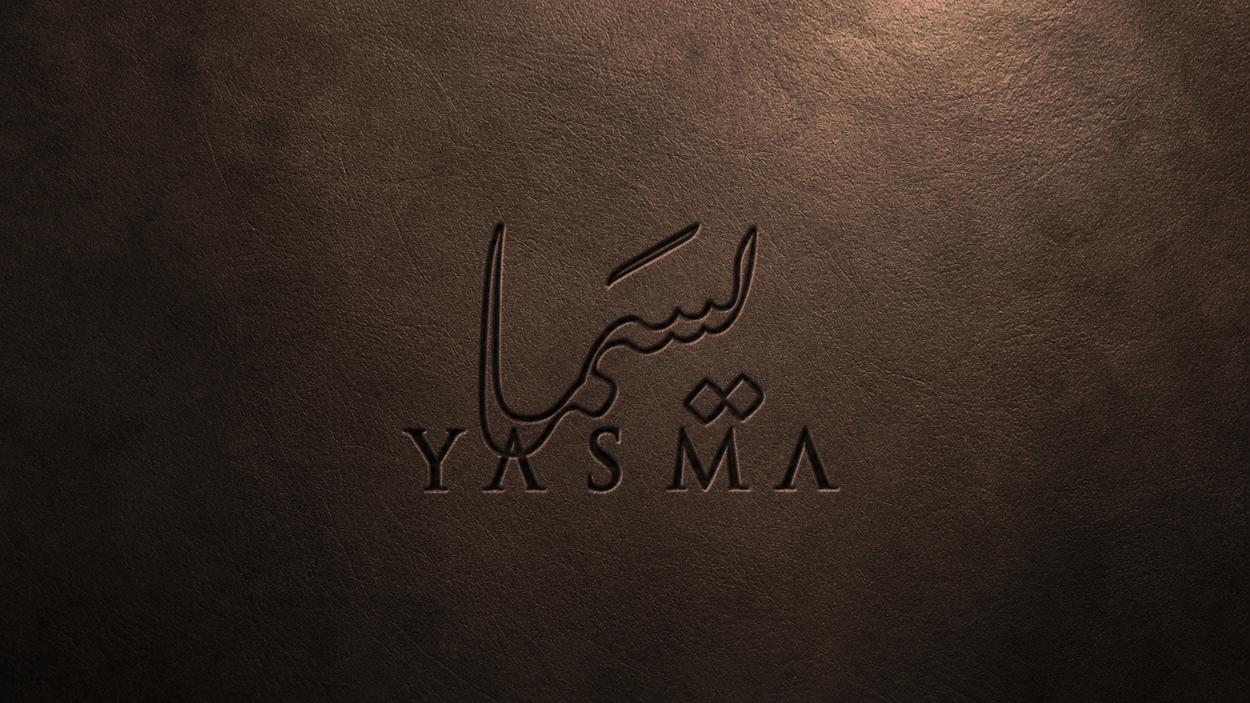
Storm built the brand from architecture instead. The logomark is drawn from the overhead view of a Damascene fountain, read as flow, community and refinement.
Project Details
Client
Yasma
Sector
Hospitality · Levantine Dining
Location
Vancouver, Canada
Services
Brand Strategy · Brand Identity · Arabic Calligraphy · Brand Guidelines · Brand Collateral · Website Design
Engagement
Website
(02)
The Challenge
Cultural depth without cultural shorthand
The easy route for a Levantine restaurant is a set of recognisable motifs. They communicate the category instantly and they say nothing specific about this restaurant, its founders or its food.
The audience in Vancouver is mixed. Guests from the region will notice anything superficial immediately; guests without that background need an entry point that does not depend on prior knowledge.
Fine dining in a competitive city also means the brand is judged physically, across menus, cards and the room itself, where a concept that only works on screen falls apart.
WHAT WE DID
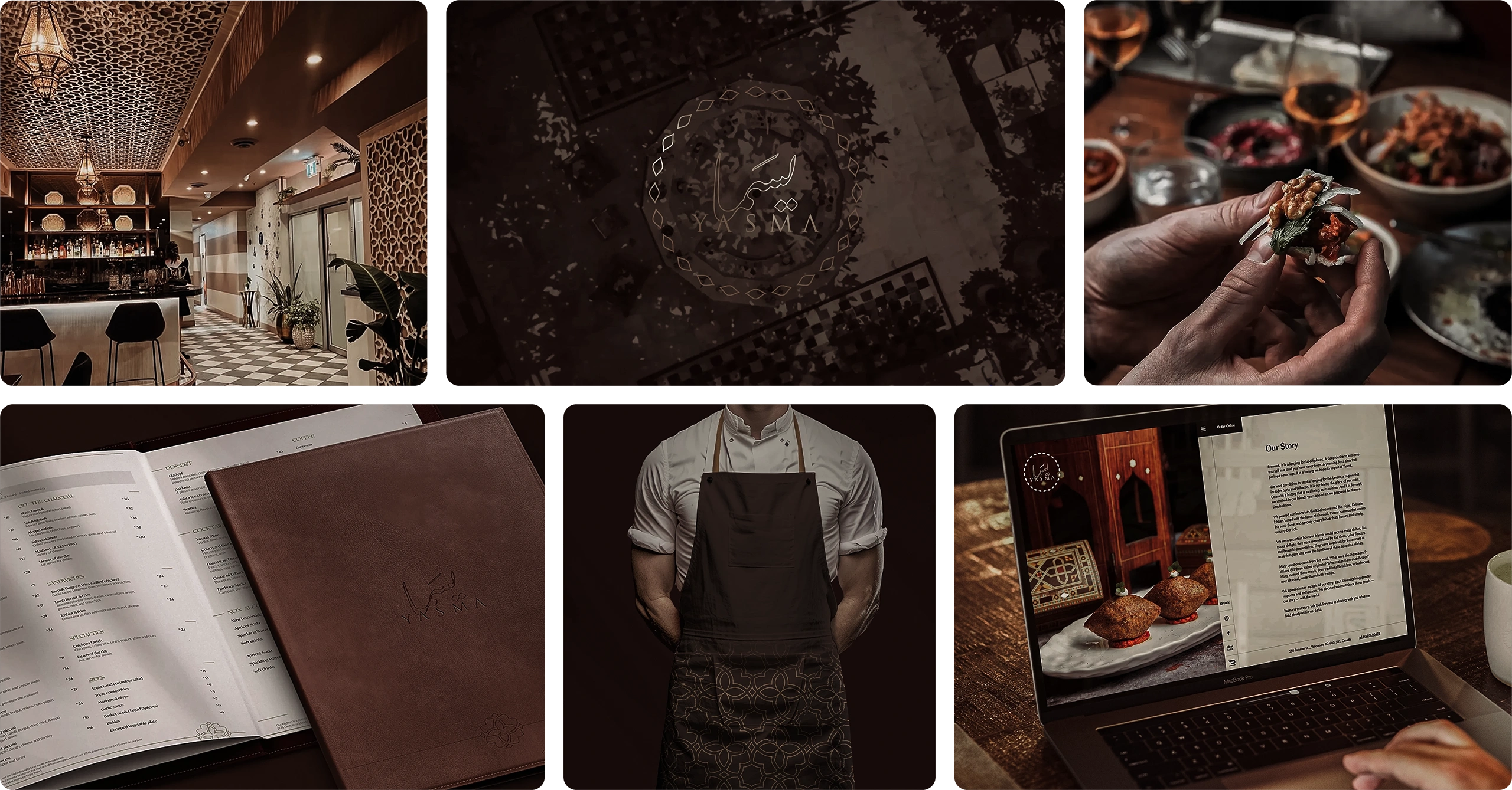
- Drew the logomark from the overhead view of a Damascene fountain
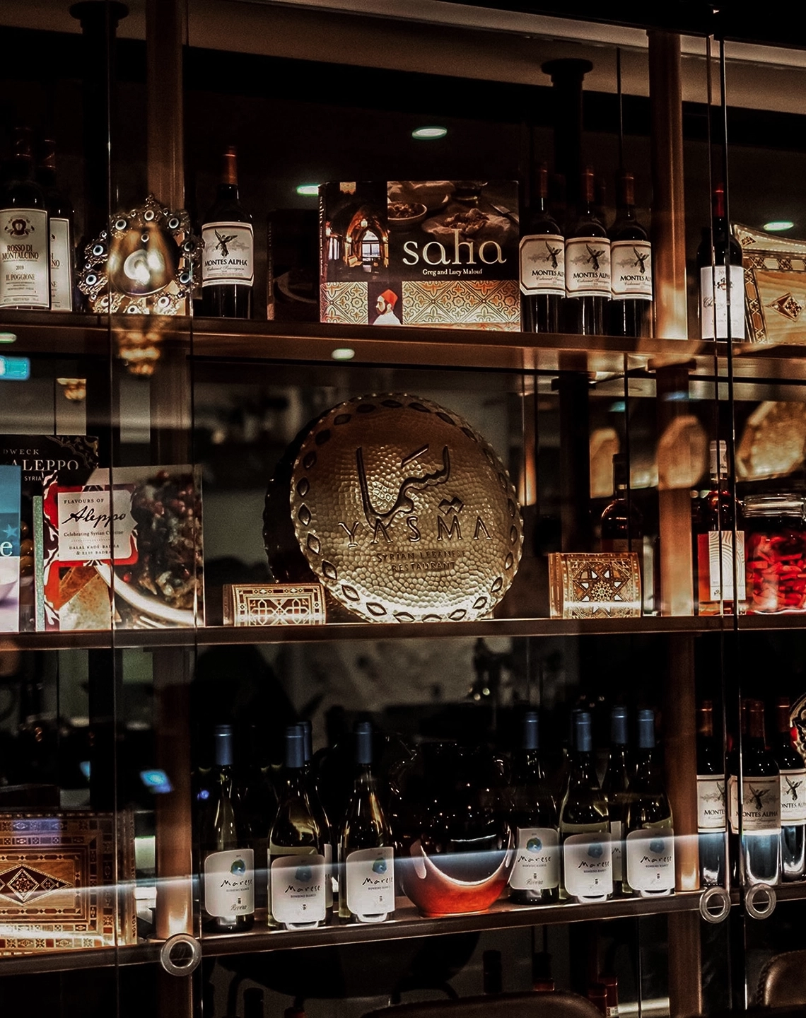
- Drew the Arabic calligraphy as original lettering rather than setting a typeface
- Built the identity on flow, community and refinement rather than on motif
- Set typography and palette to carry warmth alongside sophistication
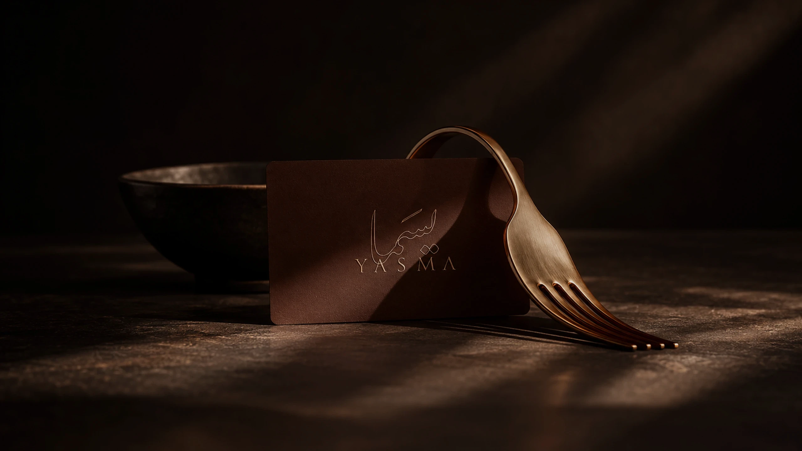
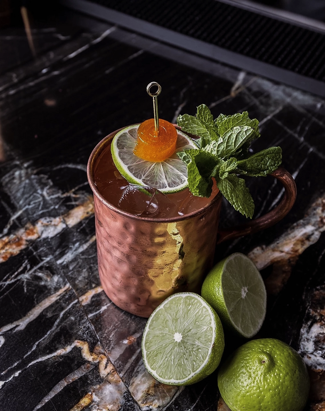
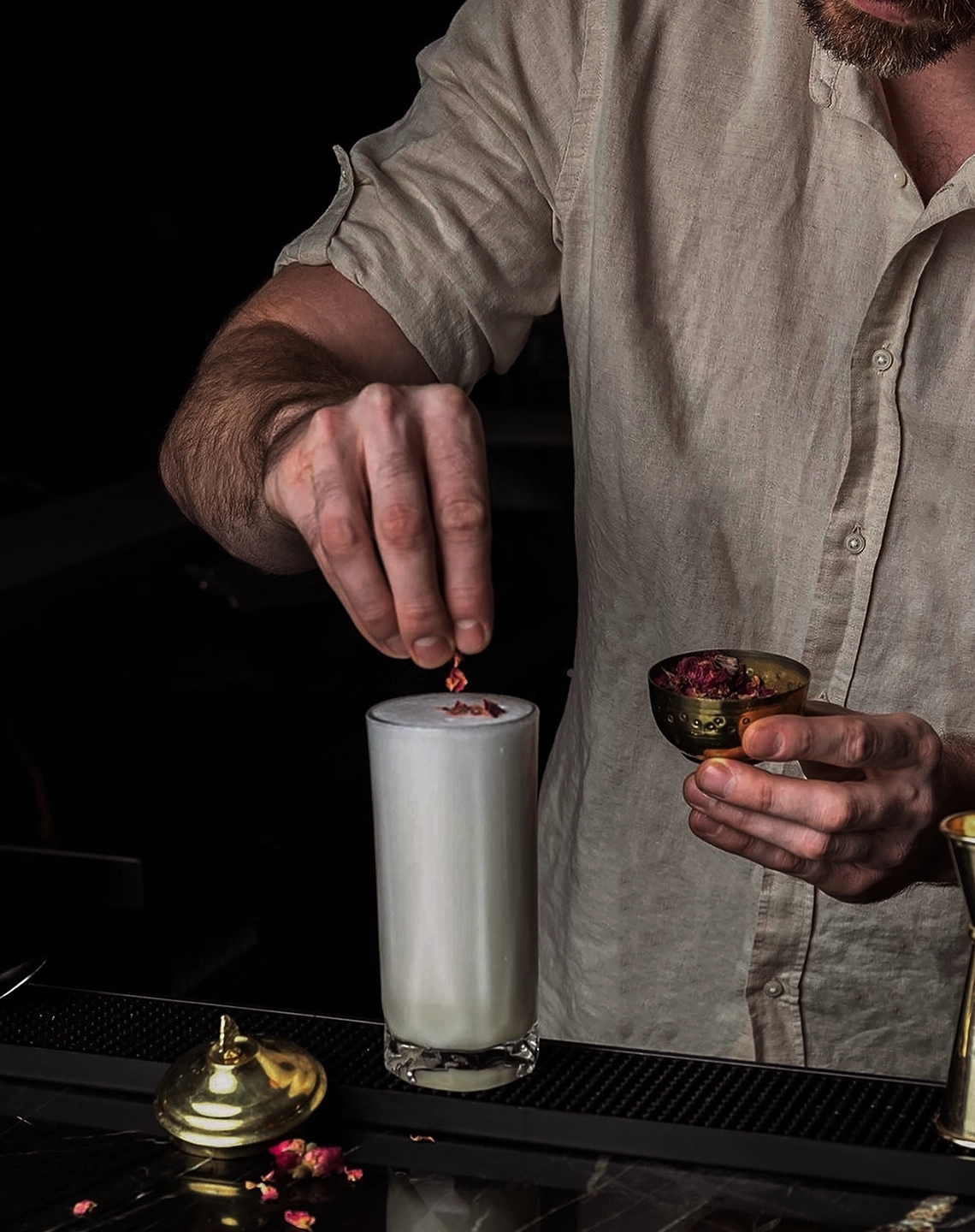
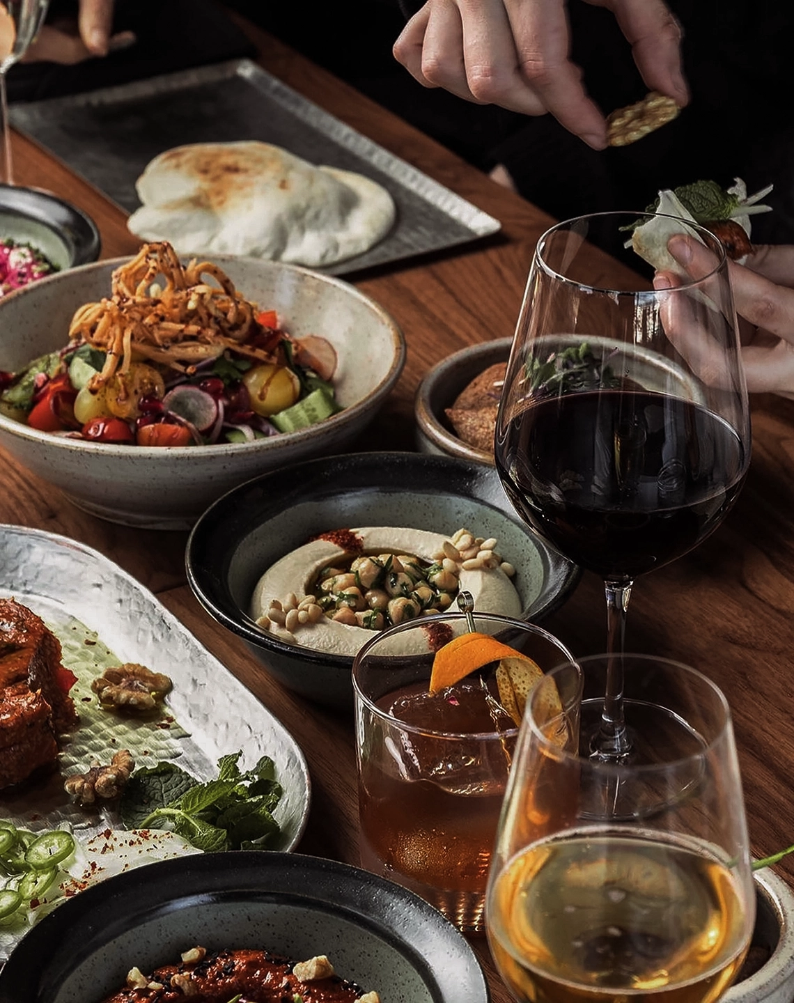
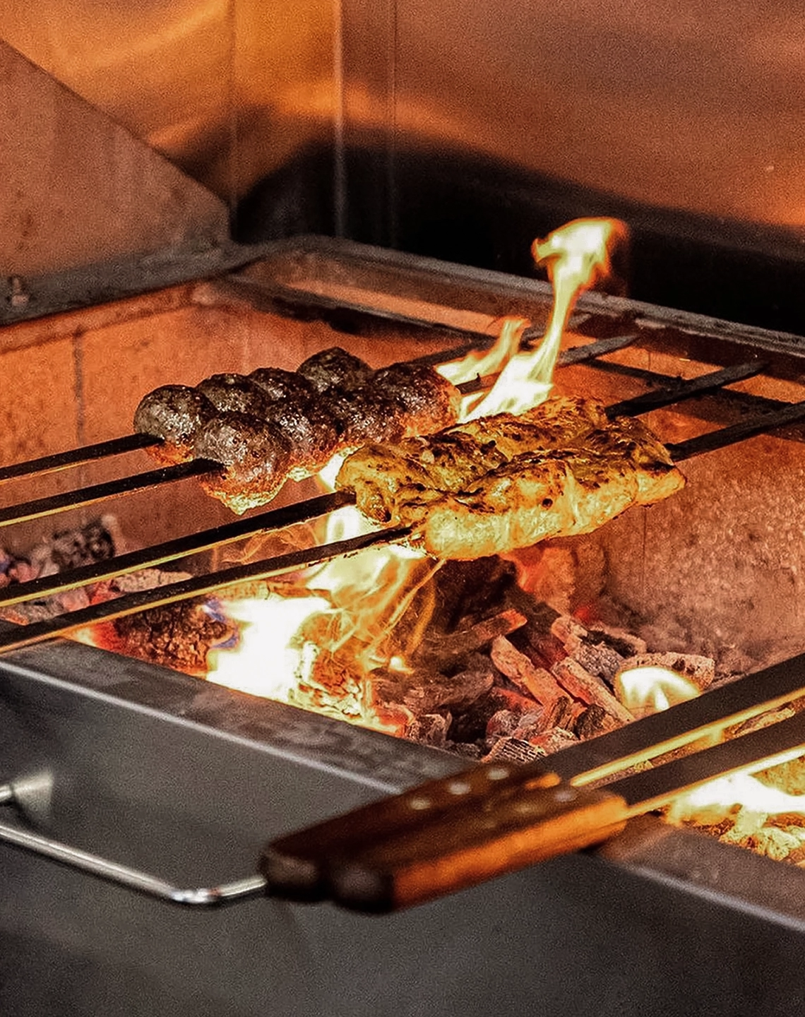
- Designed menus, cards and promotional material as extensions of the room
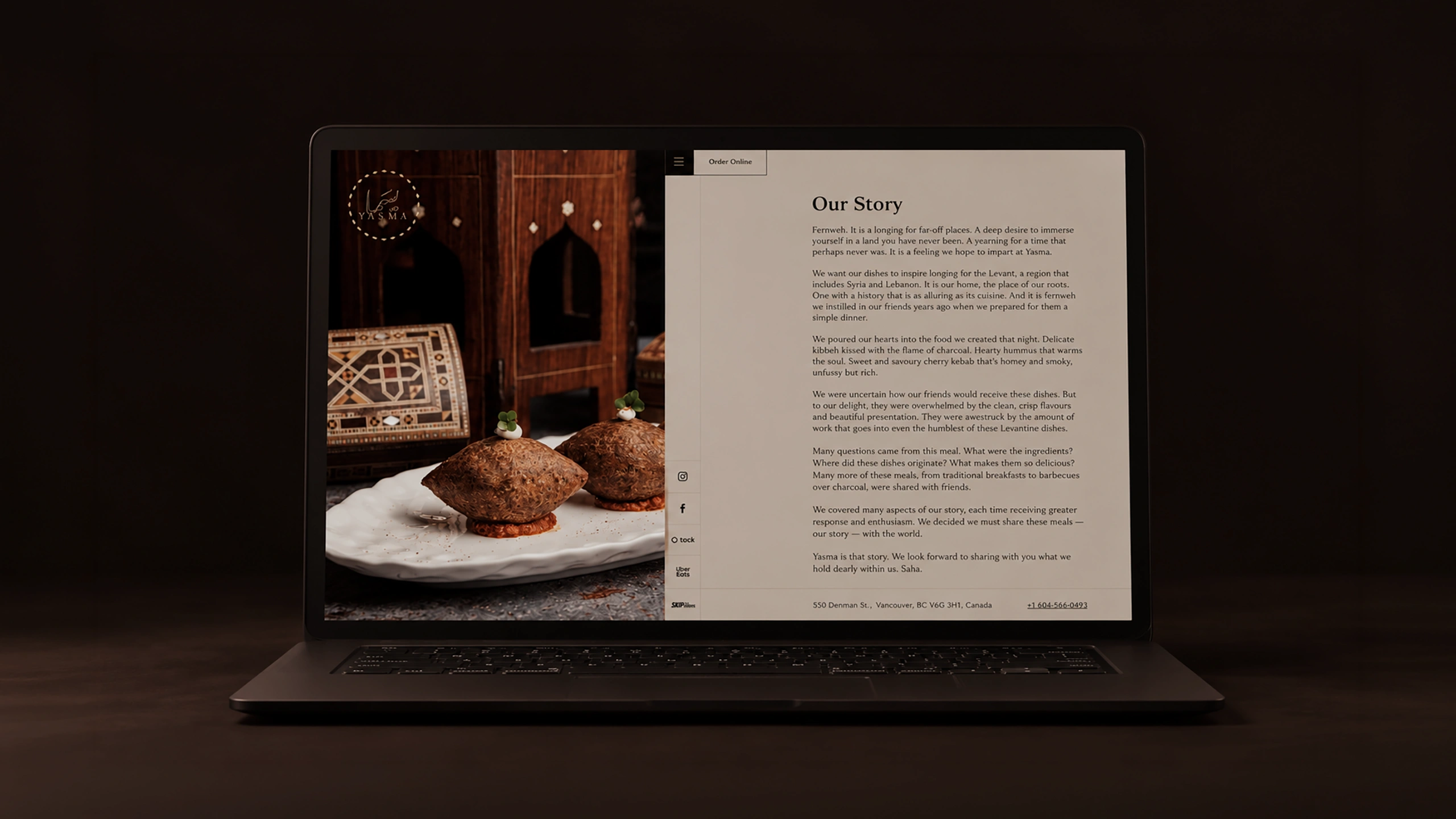
- Built the website as a digital version of the dining experience
- Held one register across every touchpoint, tasteful and textured
(03)
Storm 4D Method®
From research to reality
1/4 Discover
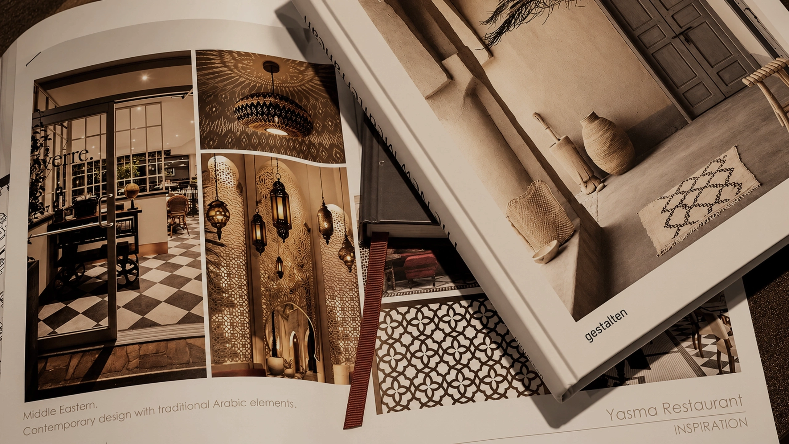
Went into Levantine architecture, flavour and tradition rather than into restaurant branding convention, because the shorthand was the thing to avoid.
2/4 Define
Positioned the brand on heritage interpreted rather than displayed, so cultural depth would be legible to guests with and without that background.
3/4 Design
Built a luxury system from historic symbolism, with the Damascene fountain logomark evoking flow and community and typography carrying warmth into sophistication.
4/4 Deliver
Extended the identity across menus, collateral and a custom website, so the brand reads as one continuous experience from the first search to the last course.

(04)
Scope of Work
Brand Strategy / Brand Identity / Arabic Calligraphy / Brand Guidelines / Brand Collateral / Website Design
(05)
Client Testimonial
“Storm studio is all about understanding the core values and personality of your brand. They did a superb job transforming our vision into the final product. They do specialize in Arabic calligraphy which is a plus.”
Sami M.
Co-Founder, Yasma Restaurant