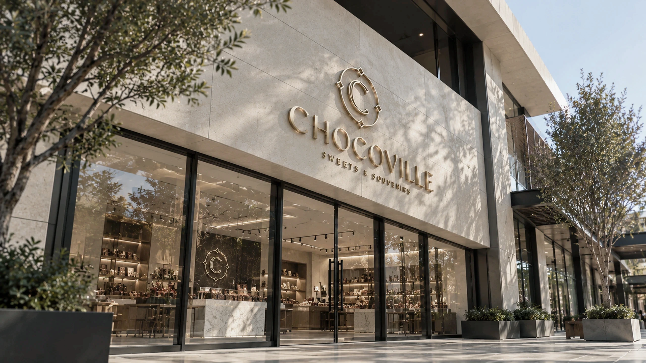
ChocoVille is a cafe and dessert concept built for the Canadian chocolate market, designed to be somewhere people sit rather than somewhere they buy and leave.
Dessert is a habit category. People return to what they already know, which makes a new name structurally disadvantaged regardless of how good the product is.
(01) Project Overview
Client
ChocoVille
Sector
F&B
Services
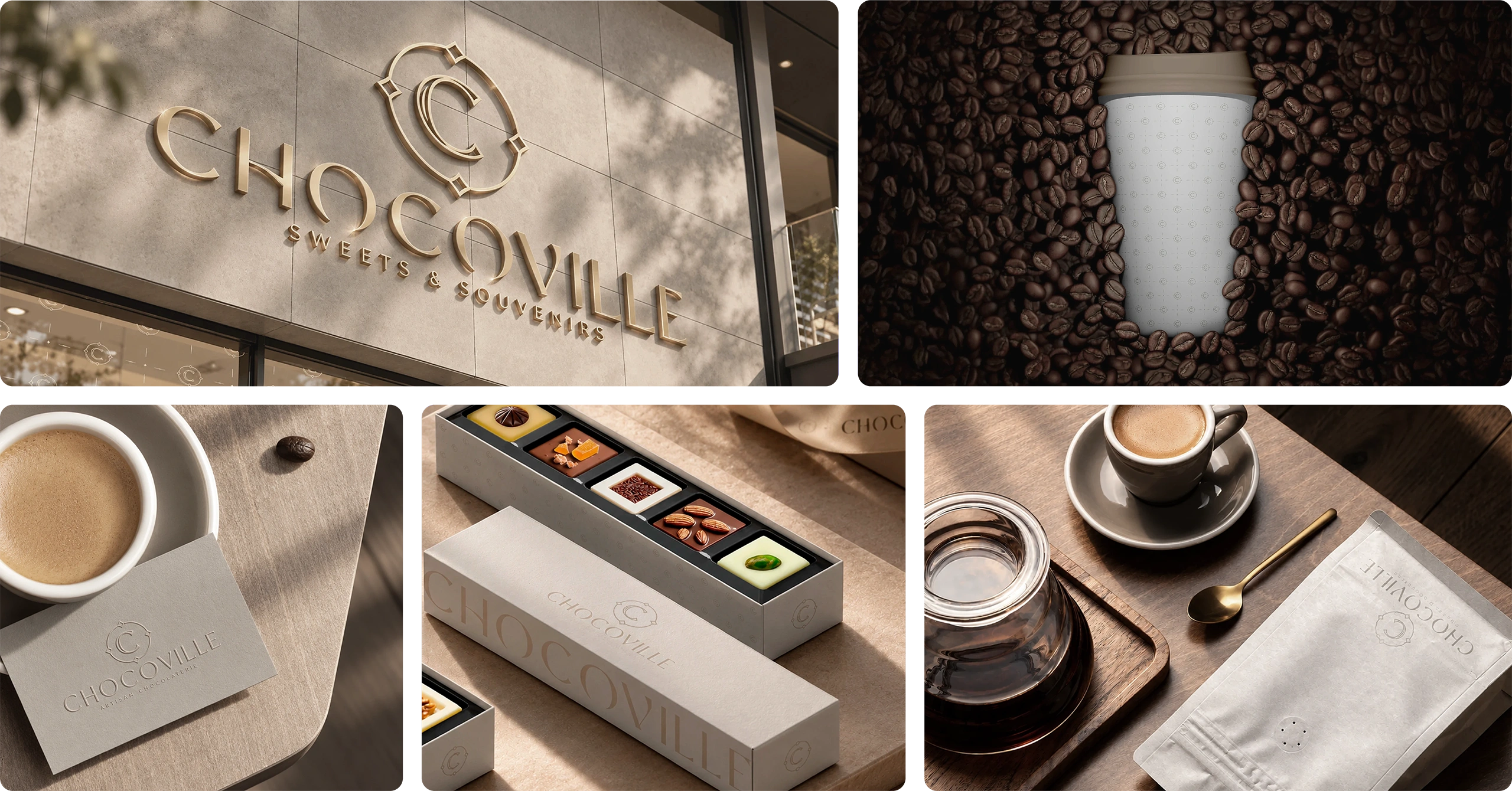
Brand Mood Board · Brand Identity · Logo Design · Colour Palette · Typography · Business Collateral · 3D Interior Design Direction
Engagement
Storm Start™
Location
Mississauga, Canada
Website
(02) Challenge
Playful and premium
Dessert branding tends to pick a side. Playful reads as inexpensive and aimed at children. Premium reads as cold and stops being an indulgence anyone looks forward to. ChocoVille needed both, because the product is genuinely premium and the occasion is genuinely light, and a brand carrying only one of those misrepresents the business. As a new entrant it also had to be memorable on first encounter, with no accumulated recognition and no existing customers to carry the name.
(03) Decision
Set the tone first
The position
The work started from a curated mood board, settling the emotional register before any design began, because tone was the thing most likely to go wrong. Playful yet polished was fixed first and held through every decision after it.
The consequence
A note of nostalgia was built in deliberately, so a brand nobody had seen reads as familiar on first encounter. The interior was directed alongside the identity, so the room and the brand make the same argument rather than two versions of it.
What was built
- A curated mood board fixing the emotional tone before design
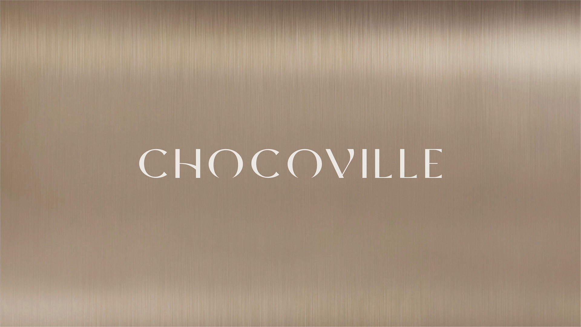
- A custom logo, palette and typography around sweetness and elegance
- A note of nostalgia so a new brand reads as familiar
- Launch collateral produced as a coherent set rather than as items
- 3D interior direction so the space and the identity argue together
How it launched
Brand and interior went out as one, so the first visit delivers the same experience the brand promises.
(04) Impact
A new name in a habit category, memorable on the first visit.