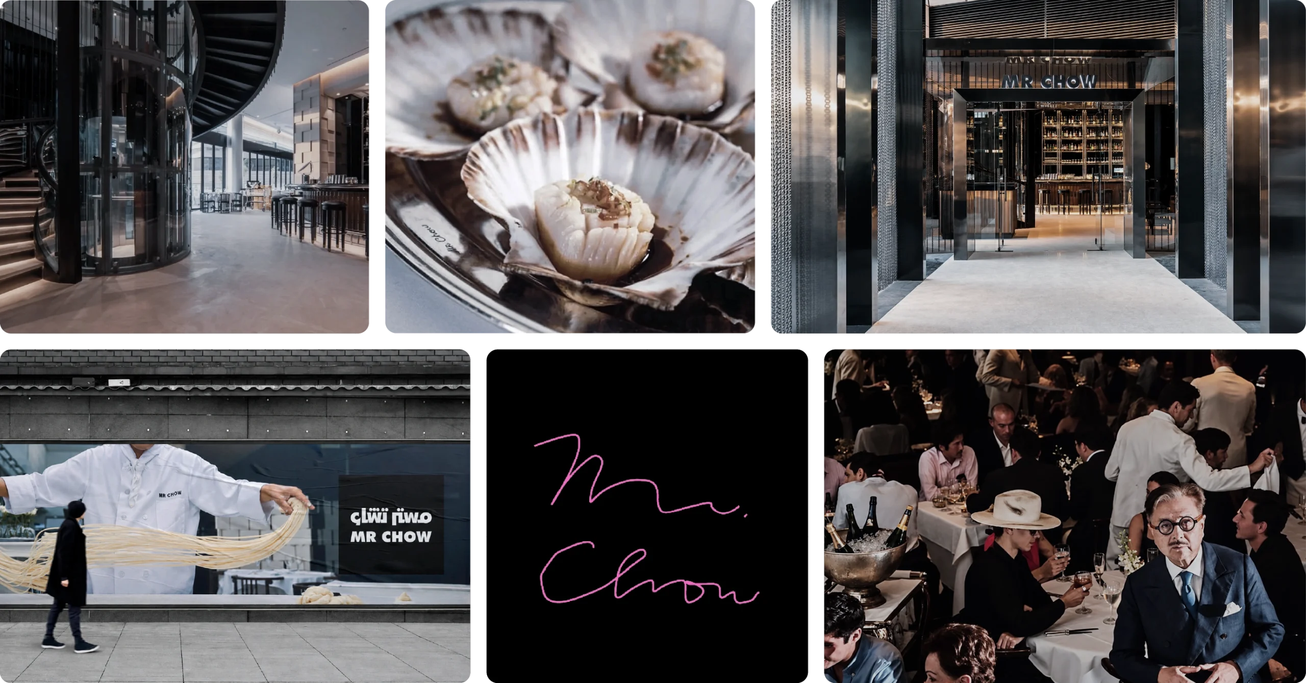
Mr Chow opened in Knightsbridge on Valentine’s Day 1968, built by Michael Chow as a bridge between Chinese cuisine and Western dining.
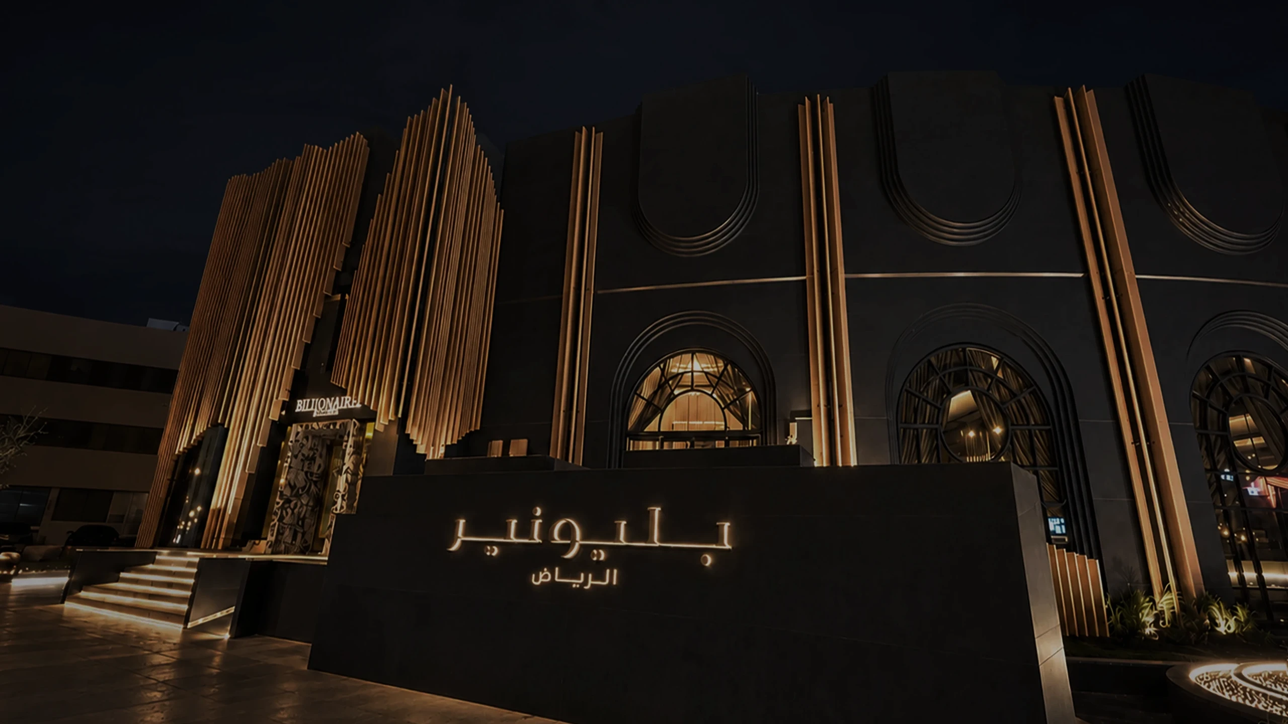
Entering Saudi Arabia under MJS Investment, it needed an Arabic identity that keeps nearly six decades of recognition and meets Riyadh’s expectations of luxury.
(01) Project Overview
Client
Mr Chow · MJS Investment
Sector
Hospitality · Contemporary Chinese Dining
Deliverables
Arabic Brand Identity · Visual Language
Credits
Brand Localization · Cultural Brand Adaptation
Engagement
Storm Partner™
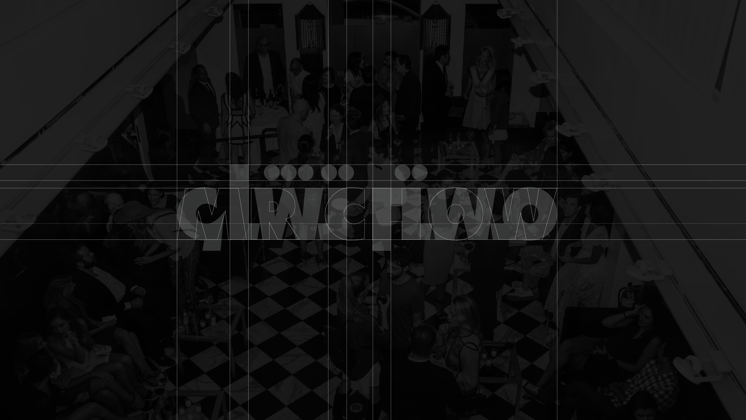
(02) Challenge
A reputation that cannot be redrawn
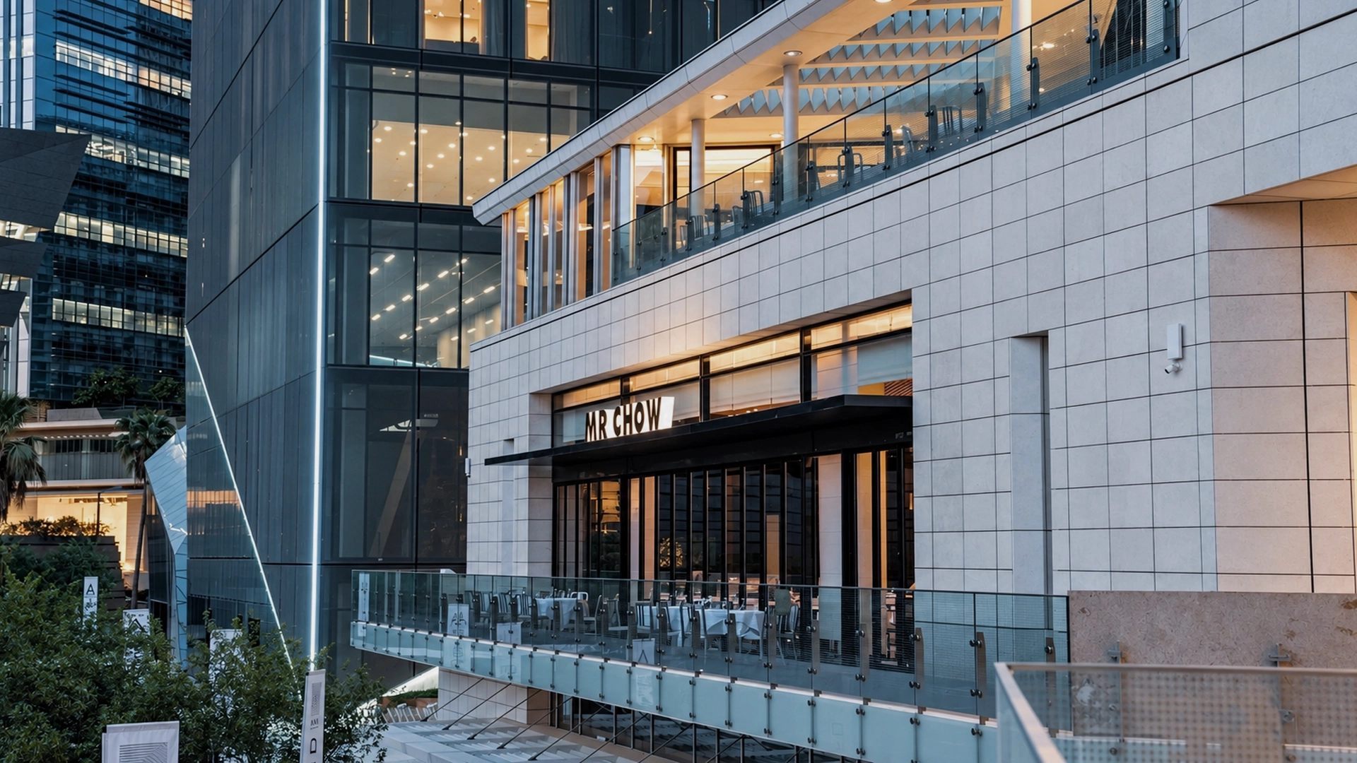
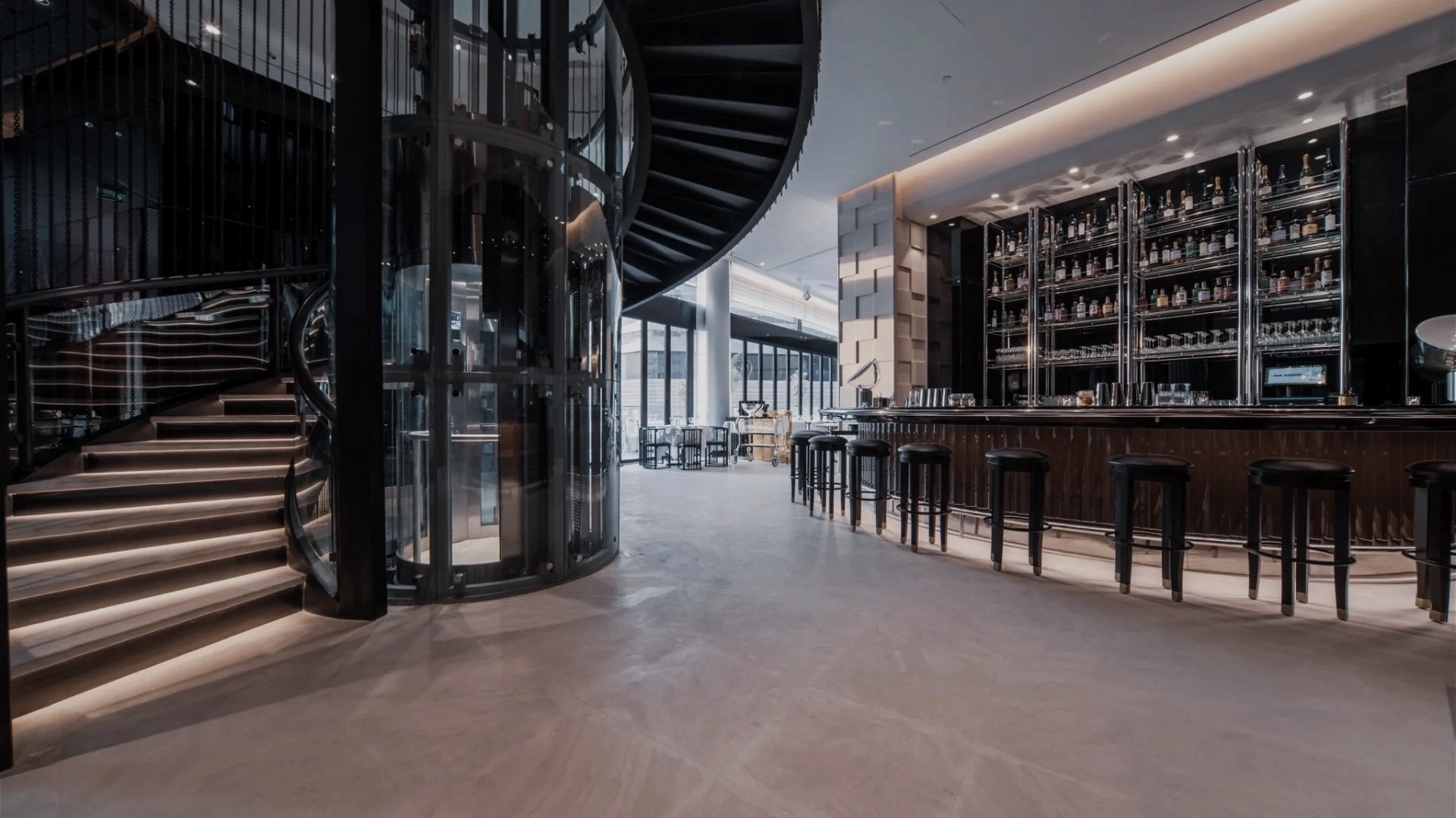
Mr Chow has spent almost sixty years as a restaurant and an art object at once. Its recognition sits in a name, a mark and a manner of service, none of which can be reworked. Localization has to stay inside those limits. Riyadh expects a register of luxury that differs from London’s or New York’s. Meeting it without adjusting reads as imported, and adjusting too far reads as a different restaurant. The Arabic also has to hold the brand’s confidence at table scale, on menus, signage and collateral, where nothing can be approximate.
(03) Decision
One house, two scripts
The position
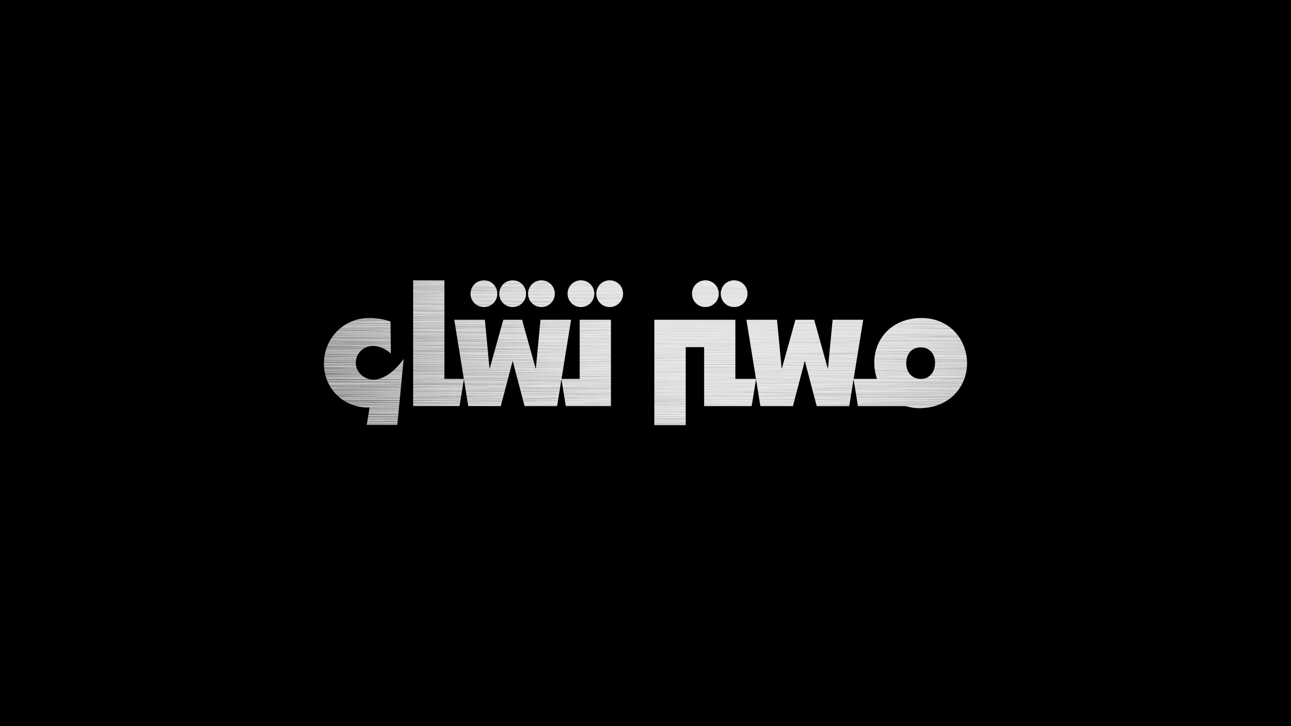
Treat the Arabic as a second voice of the same house. Protect the original’s confidence and meet the register Riyadh expects of luxury.
The consequence
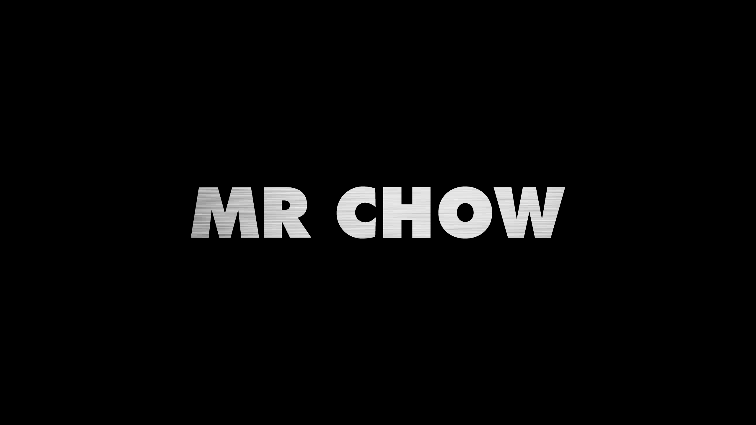
The Arabic letterforms had to match the weight, contrast and spacing of the Latin mark, drawn to its standard from the first sketch.
What was built
- An Arabic adaptation that keeps the poise of the original mark
- Visual equivalence between Arabic and Latin, matched in weight and rhythm
- Typography, iconography and layout refined to the original’s standard
- A luxury register suited to Riyadh, without diluting the brand’s East and West character
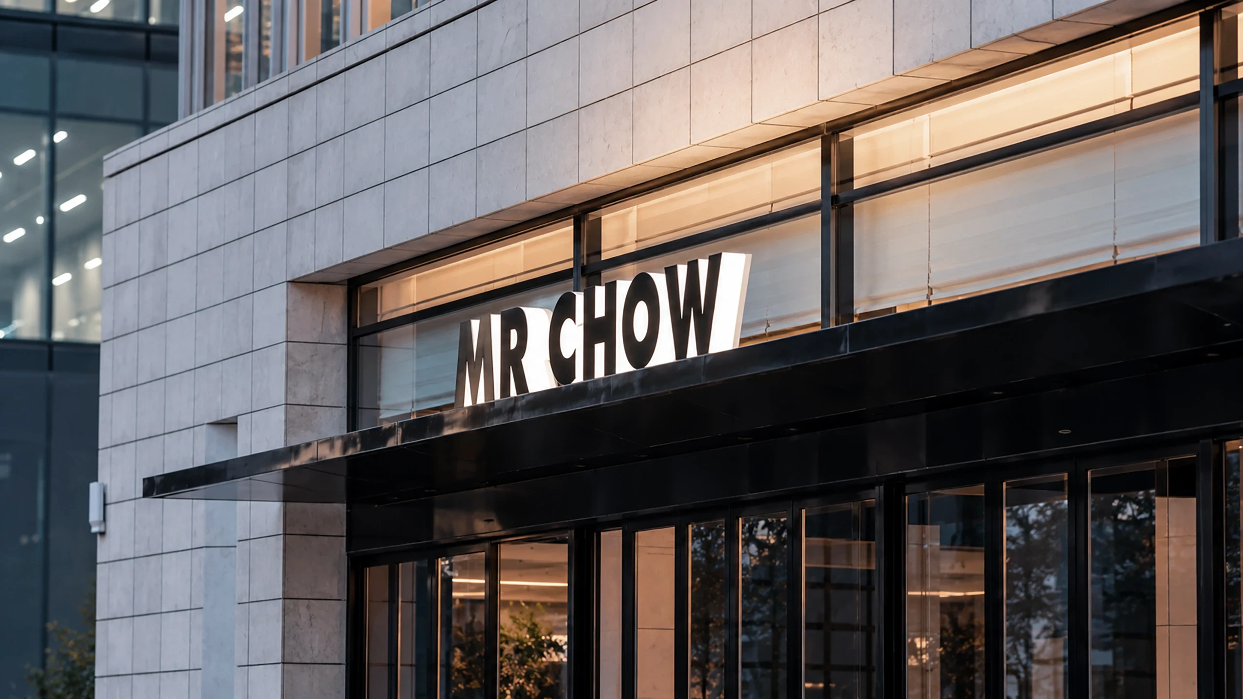
- A system applied where fine dining is judged: menus, signage and collateral
How it launched
The Arabic identity went out across the opening applications, so the Riyadh edition reads as a natural extension of a global brand. Engagement: Storm Partner™.
(04) Impact
The same house, with the same confidence, in Arabic.